Animating a dot grid with cursor movement
Stitch's canvas darkens the dots under your cursor. I wanted the same press on my grid, so I inspected it: two copies of one tile, a radial mask, and a fade Stitch doesn't have.
Stitch's canvas has a detail I kept noticing: the dot grid under the artboards darken around the cursor. My site sits on a dot grid as well, and I wanted its dots to darken like a pencil pressed into paper, so I went looking at how Stitch does it.
The answer is one extra layer, one mask, and three CSS variables that a script updates once per frame. The rest of this post is that code, and the fade I added so the dots settle when the hand stops moving.
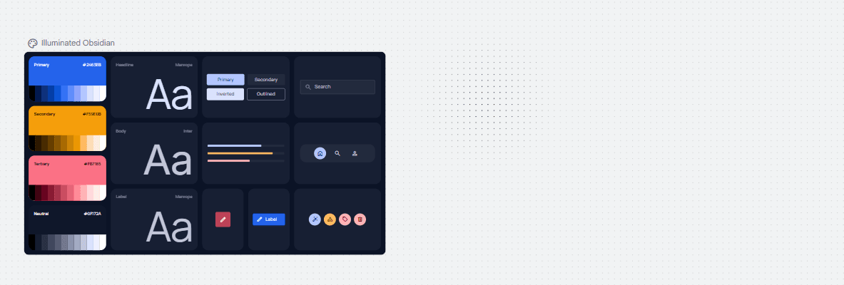
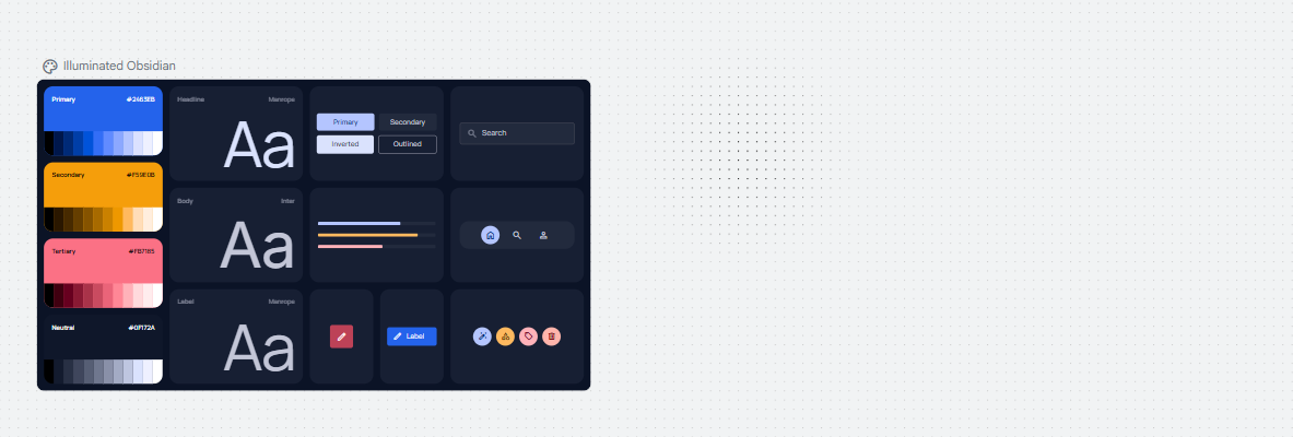
Stitch draws the grid twice and masks the top copy
Inspecting the Stitch canvas shows two identical dot-pattern SVGs stacked on top of each other. The bottom one is light gray and always visible. The top one is black and masked to a circle around the pointer. On every mousemove the app rewrites an inline mask on that top layer:
mask-image: radial-gradient(100px at 900px 300px,
  #000 0%, rgba(0, 0, 0, .8) 25%, rgba(0, 0, 0, .4) 55%, transparent 100%);
The mask jumps to the new coordinates each frame. When the pointer leaves the canvas the layer gets a fully transparent mask and opacity zero.
The dark layer is the same tile as the light one, so the highlighted dots land exactly on the resting dots and nothing appears to move. The gradient stops give the disc a shoulder rather than a linear falloff: full strength at the center, still 80% a quarter of the way out, 40% just past halfway, then a fast drop to nothing.
Move the mask, not the gradient
Rewriting a viewport-sized gradient on every mousemove works, but it re-rasterizes the mask each frame. The same result comes from rasterizing the disc once and moving it. The mask image is sized to the disc, set to no-repeat, and positioned from two variables:
:root {
  --mx: 0; --my: 0;      /* pointer, viewport px, set by script */
  --press: 0;            /* 1 while the pointer moves, 0 at rest */
  --press-d: 240px;      /* disc diameter */
}

.container::before {
  content: '';
  position: fixed; inset: 0;
  z-index: -1;
  pointer-events: none;
  background: var(--grid-press);
  background-size: 120px 120px;
  background-position: 12px calc(57px + var(--sy) * (var(--rate) - 1) * 1px);
  mask-image: radial-gradient(closest-side,
    rgb(0 0 0) 0%, rgb(0 0 0 / .8) 25%, rgb(0 0 0 / .4) 55%, transparent 100%);
  mask-size: var(--press-d) var(--press-d);
  mask-repeat: no-repeat;
  mask-position:
    calc(var(--mx) * 1px - var(--press-d) / 2)
    calc(var(--my) * 1px - var(--press-d) / 2);
  opacity: var(--press);
}

@media (hover: none), (prefers-reduced-motion: reduce) {
  .container::before { display: none; }
}
--grid-press is the site's grid tile, but with more opacity. The background-position formula is the one the site already uses to keep a fixed copy of the grid in phase with the scrolling one during parallax, so the darker dots sit exactly on the resting ones at any scroll offset. The closest-side keyword makes the gradient's radius half the mask size, so the disc fills its box and the rim lands at transparent.
The variables are unitless on purpose. The script writes raw clientX and clientY, and the multiply by 1px happens in the calc. The --sy variable for scroll already works that way.
The script side is small. The site already had a scroll listener that sets --sy inside a single requestAnimationFrame, so the pointer rides along in the same frame:
var mx = 0, my = 0, press = 0, pointerDirty = false;

function apply() {
  pending = false;
  root.style.setProperty('--sy', String(window.scrollY || 0));
  if (!pointerDirty) return;
  pointerDirty = false;
  root.style.setProperty('--mx', String(mx));
  root.style.setProperty('--my', String(my));
  root.style.setProperty('--press', String(press));
}

if (matchMedia('(hover: hover) and (pointer: fine)').matches) {
  addEventListener('pointermove', function (e) {
    if (e.pointerType === 'touch') return;
    mx = e.clientX; my = e.clientY; press = 1; pointerDirty = true;
    schedule();
  }, { passive: true });
  root.addEventListener('mouseleave', function () {
    press = 0; pointerDirty = true;
    schedule();
  });
}
schedule() is the existing rAF debounce. Nothing runs on a loop; when the pointer is still, nothing runs at all. Touch is ignored, and the media query means phones never attach the listener in the first place. The CSS hides the layer for (hover: none) as well, so a device with no fine pointer pays nothing.
Fade out on stillness, not on leave
The first version was Stitch-faithful: instant on, instant off. After living with it for a bit, I wanted the dots to settle when the hand stops. Moving the cursor should press them immediately. Stopping should let them fade back. Moving again should press them again, fast.
That's an idle timer on the script side and two different durations on the CSS side.
var PRESS_IDLE_MS = 150;
var idleTimer = 0;
function rest() { press = 0; pointerDirty = true; schedule(); }

// inside the pointermove handler, after setting press = 1:
clearTimeout(idleTimer);
idleTimer = setTimeout(rest, PRESS_IDLE_MS);
Mouse events arrive every few milliseconds while the pointer moves, so 150ms of silence only ever happens when the hand has stopped.
I use a single variable for both durations. Transitions take their settings from the new style, so a duration computed from --press is .2s on the way in and 1s on the way out:
:root { --press-in: .2s; --press-out: 1s; }

.container::before {
  opacity: var(--press);
  transition: opacity ease-out;
  transition-duration: calc(
    var(--press) * var(--press-in) + (1 - var(--press)) * var(--press-out)
  );
}
The disc comes up fast and settles slowly, with no class toggling and no second variable from the script. The position is still never eased. Only the opacity is.